From the streets of Brussels to Athens, and even in Santiago or Sydney, we all understand the rules: Red means stop, and Green means go.
“It’s an international standard,” says Marcelis of the colors on traffic lights around the globe. Marcelis is a software engineer responsible for research and development with ILIAS Solutions, and since his software is used all around the world, he decided to borrow that traffic light color scheme. “We use the red, green, yellow colors to show the state of certain assets,” he says. Red if something is in short supply, yellow means it needs investigation, and green tells the user that everything is within working parameters.Mio Adilman, the host of “Repeat Customer,” a podcast about customer experience, says using Red-Yellow-Green for a status reports is just a starting point.
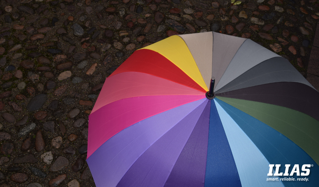
“We know that our eyes and brains can distinguish and differentiate between about 10 million different colors,” he says. “And each of those colors does certain things to us.”
Retailers have capitalized on these associations for years.
“In general, blacks and silvers are luxury products. Really bright colors are usually more affordable mass market things. If you think about McDonald’s and Walmart, those are cheap and cheerful,” he explains. “Warm browns and earthy tones are lifestyle brands, like Patagonia and those sorts of things. And anything that has a wood grain to it is seen as relaxing because it makes us feel like we’re outdoors.”
That use of color can be put to work in product packaging, advertising, staff uniforms, even the color you paint the walls of your office.
“There’s a reason why when you go to a doctor’s office, it’s often very white,” Adilman says. “White can give you the sense that there is order in your environment. It has a stabilizing effect. It’s meant to project cleanliness and order, and put people’s minds at ease.
Marcelis has to consider all that as he designs the latest generation of ILIAS’s software.
“I’m now working on a complete redesign of the user interface,” he says. “We’re doing a lot of research and it’s completely different from the existing one.”
That new iteration will rely heavily on one color: Blue.
“Why did we choose blue? It’s the branding color of ILIAS, but it’s also a very soothing color,” Marcelis explains. “It’s very neutral. We didn’t want to be loud and aggressive.” Adilman agrees.
“Blue projects trustworthiness,” he says. “You’ll notice that a lot of banks use blue in their logos and in their retail operations because they want to convey that sense to their clients.”
Marcelis says he has been very intentional about how he applies it.
“We use it to give accents to things, to really make them pop. It shows that things are interactive. Buttons are blue. If it’s the main button you are expected to press to follow the main workflow, then it will be blue, and it will really stand out. All the other buttons will be white with the blue text. So, you still know it’s interactive and it’s something you can do, but it’s optional. It’s not the main flow.”
Using colors to communicate is a great tool. It can convey information in a very bold and obvious manner (like the traffic lights), or the associations can be quite subtle (using blue to build trust). But you have to know your audience.
“Colors are a language, and that language varies from culture to culture,” explains Adilman.
“We’re working for big international defense organizations,” Marcelis adds. “So, by definition, we work with all these cultures as well.”
That’s why he’s restricted himself to just the basics. There will be no orange, or pink, or brown in the latest iteration. As least until he can be sure that everyone seeing it reacts to those colors in the same way.
It’s an ongoing effort,” he says. “We are always looking for better and improved interfaces.”
Having dealt with the challenge of using color as a language, his next obstacle will be accommodating actual different languages.
“It’s in English, in Dutch, in French, and in Spanish currently,” he says. But up next are some more challenging languages. “We’re working on incorporating special things like right to left languages because it has a huge impact on the entire interface as well.”
That is still to come, but if you stare long enough at the soothing shade of ILIAS blue, you’ll trust he’s going to figure it out.


